
Apple Ical revamp
USER Experience research and design modifications
Together with a group of other UI/UX designers, I executed the research, testing and interface improvements for the Apple Calendar iPhone Application.
RESEARCH
Explore business needs
goal of our improvements
- Increase ease of use for current users
- Increase appeal for new users
gather data
user interviews
Here are a few of the questions we asked:
- What is most enjoyable about your calendar app? Why is it enjoyable?
- Are there any frustrations while you use your calendar app? What are they, and why are they frustrating?
What is your default/most viewed calendar format (day, week, month, etc.)? Why?
We asked our interviewees to preform TASKS using their calendar app. We watched how they navigated the app and took note of any frustrations & hesitations.
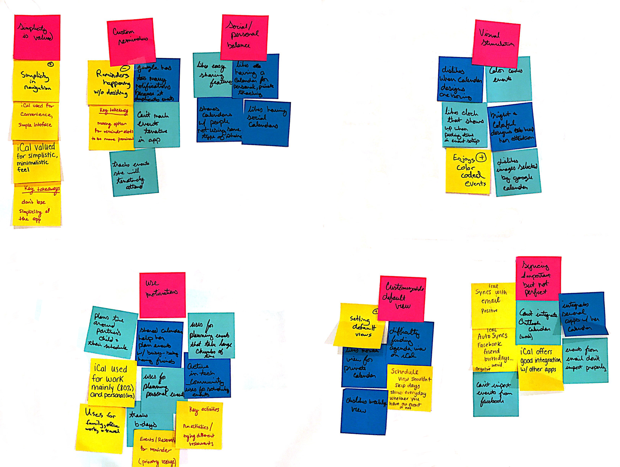
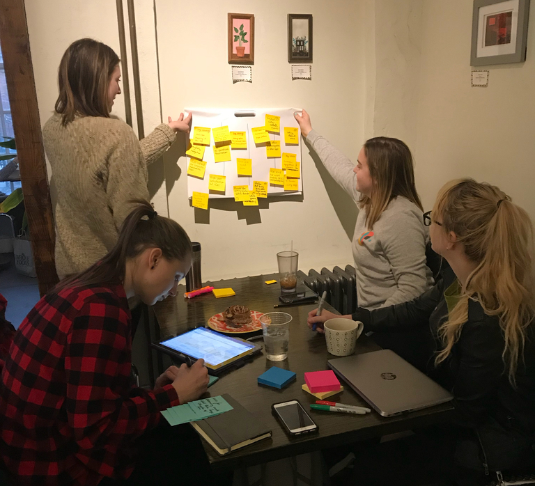
Affinity mapping
Affinity mapping allowed us to organize our user feedback, look for trends and see comonalities.
user personas

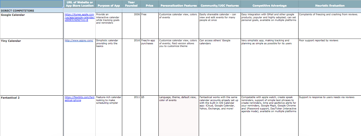
competitive analysis
our findings
user PAIN POINTS:
- Make iCal more visually stimulating
- Allow the user to change the default calendar view and the app remains in that view until the user changes it again
- Make it more clear to users which calendar is shared with others vs which calendars are not (public vs private)
our solutions
visually stimulating:
- Allow users to select the colors they want for a given calendar and event
- Incorporate a color-wheel that users can select from
change default calendar view:
- Add an “eye” icon which can be selected, popup appears and user selects between month, week, day
- Calendar will remain in that view until the user changes it again
shared calendar clarity:
- Small icon of two people will appear in the event block if the calendar is shared
- Creating a visual signal to allow the user to quickly and easily identify if their event is shared
PROTOTYPING
Since this project is a revamp and not a completely new design, I visually modified the existing iCal interface to display the changes we implemented.